QSvgStyle Engine
Overview
The QSvgStyle Engine is a Style Engine for Qt desktop applications that allows you to change the appearance of Qt5 applications using SVG themes
Refer to Quick start guide for compile, run and test instructions
Feature Summary
Themes: Change the appearance of Qt5 applications without any programming knowledge.
Fast rendering: Fast rendering. QSvgStyle renders at the speed of a raster engine, which is at least twice faster than the SVG rendering.
Inheritance system: Keeps theme configuration files to a strictly minimal size
Palette support: your current desktop color scheme can be applied on top of the rendered theme, as well as any QPalette set on a widget.
Capsule grouping: buttons can be laid out in capsules.
Variant support: the arrangement of some complex widgets can be tuned
RTL support: complete support for Right to Left layouts
Animated busy progress bars
Built-in default theme
Style Engines
Qt style engines are written in C++ and come in the form of shared libraries that are loaded by Qt applications. A style engine is the component responsible of the appearance of Qt widgets, this includes buttons, scroll bars, check boxes, …
Qt already comes with style engines that mimic the native style of the OS it is running on:
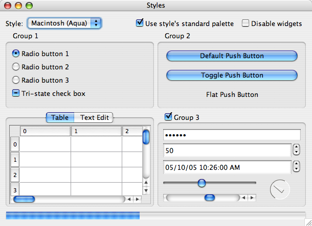
Aqua Style on Mac OS¶ |
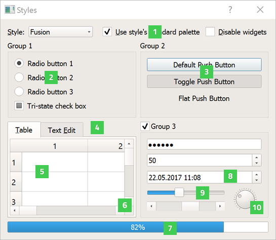
Fusion Style on Linux¶ |
There are also very few other style engines written by other people around the web. Most famous ones are QtCurve and KDE breeze.
Writing a Qt style engine is complicated and involves both good C++ and Qt knowledge. This is clearly not an acceptable way of tuning the appearance of an application nowadays as there are many less complicated ways of doing it at the reach of non programmers, such as using CSS style sheets or a collection of images (a.k.a themes).
QSvgStyle (formerly QuantumStyle) is the first style engine that not only allows non programmers (e.g. designers) to make themes, but also the first style engine to use Scalable Vector Graphics (SVG) for its themes.
Note
QSvgStyle is a pure Qt5 style engine. It does not depend on KDE libraries.
SVG documents
An SVG document is an XML based file format for storing drawings. Unlike most formats that store pictures as pixel data (raster, like PNG and JPEG) in a binary format, SVG documents store drawings information as points and curves in clear text format.
Here is an example of an SVG file:
<?xml version="1.0" encoding="UTF-8" ?>
<svg xmlns="http://www.w3.org/2000/svg" version="1.1">
  <rect id="rect1" x="25" y="25" width="200" height="200" fill="lime" stroke-width="4" stroke="pink" />
  <circle id="circle1" cx="125" cy="125" r="75" fill="orange" />
  <polyline id="poly1" points="50,150 50,200 200,200 200,100" stroke="red" stroke-width="4" fill="none" />
  <line id="line" x1="50" y1="50" x2="200" y2="200" stroke="blue" stroke-width="4" />
</svg>
And here is the rendered output (except the grid):
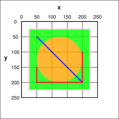
Such drawings are scalable, meaning that zooming does not lead to any pixelization. Each time the drawing is scaled, points are relocated accordingly and curves are recomputed. As a consequence, SVG drawings are always smooth. For example, if you are designing an icon set for your favorite desktop environment, you no longer need to provide your set in different sizes if you design it in SVG.
Also note the id attribute. It is a mean of uniquely identifying
the SVG object. QSvgStyle engine uses the id attribute to retrieve
correct shapes to use for widgets.
See https://en.wikipedia.org/wiki/Scalable_Vector_Graphics for a detailed description and examples.
Like for raster images, there are a number of applications used to create SVG drawings, with variable support for the SVG standard and also proprietary additions to it.
Note
QSvgStyle distribution does not supply a tool for creating SVG drawings
We recommend using Inkscape, a very popular free and open source vector drawing program. Themes created in Inkscape are correctly rendered in Qt, this means that Qt will show the SVG document exactly as you see it when creating it with Inkscape.
Files
Global Configuration File
QSvgStyle engine uses a global configuration file per user located in:
$ConfigLocation/QSvgStyle/qsvgstyle.cfg
Where ConfigLocation is the path output by the qtdiag
utility, usually it is ~/.config.
This file is used to store the currently active theme, as well as engine specific tweaks. You do not need to manually edit this file, instead use the QSvgThemeManager Application to manage it.
Themes
A theme for QSvgStyle engine is a directory containing two files:
The Theme SVG file: an SVG file containing the theme shapes for buttons, scroll bars, …
The Theme Configuration File: an accompanying configuration file that mostly specifies which SVG elements are used to draw which widget, sizes of some elements, margins, …
The directory name and the two files must have the same
basename. For example, a theme located inside a directory
myTheme must contain the files myTheme.svg and myTheme.cfg
Here is an example of what a theme directory looks like:
myTheme/
  myTheme.cfg
  myTheme.svg
Theme SVG Files are created using Inkscape and Theme Configuration Files are created using the QSvgThemeBuilder Application.
Note
QSvgStyle engine already comes with a built-in theme. You do not need to install a first theme to use QSvgStyle engine.
There are two locations that are searched for themes, in that order:
The current user theme directory located in:
$ConfigLocation/QSvgStyleThe system theme directory located in:
$PrefixPath/share/QSvgStyle
Where ConfigLocation and PrefixPath are the paths output by the
command:
qtdiag
Warning
The current active theme is identified by its name,
not its directory name. The name is an entry in the
theme configuration file described above.
Note
If a theme exists in both user and system directories, the user theme takes precedence.
Theme Configuration File
The theme configuration file must be located in the theme directory
and must hold the same basename as its directory and have the .cfg
suffix.
A theme configuration file is a simple text file containing key-value pairs grouped in sections. Here is an example:
[%General]
name=my theme
author=me
comment=a very beautiful theme

[ToolButton]
element.inherits=PushButton
frame=true
frame.element=button
frame.width=4
indicator.element=arrow
indicator.size=7
interior=true
interior.element=button
interior.xrepeat=0
interior.yrepeat=0
label.hmargin=0
label.iconspacing=3
label.vmargin=0
...


[Tweaks]
specific.spinbox.variant=1
specific.radiocheckbox.label.tispace=5
...
Theme configuration files are generated by the QSvgThemeBuilder Application. They contain:
The special section
%General. It holds metadata about the theme, especially itsname. This is the name that will appear in QSvgThemeManager Application when choosing the active theme to use.The special section
Tweaks. It holds specific theme settings like the variant used for some widgets and some dimensions.Other sections. Each of them describes how a widget or a part of a widget must be rendered by QSvgStyle engine. Its contents consist in Frames, Interiors, Indicators and Labels settings.
Note
Not all possible settings are present in a section. The
special setting element.inherits allows a section to inherit all
the settings of another section. See Inheritance for more
details.
Theme SVG file
The theme SVG file must be located in the theme directory
and must hold the same basename as its directory and have the .svg
suffix.
Warning
Compressed SVG files (svgz) are currently not supported.
A theme SVG file is a standard SVG file that contains the objects that QSvgStyle engine will use to render widgets, like frames, interiors and indicators.
QSvgStyle engine expects this single file to contain all the necessary objects to render all the widgets. In order to know which SVG objects are used to render some widget, it requires that SVG objects follow some naming rules.
SVG objects can be given names. In the SVG terminology, these are
called id and appear in the SVG XML tag as attributes like this:
<rect id="rect1" width="200" height="200" />
In this example, this rectangle has the id rect1.
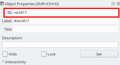
Hint
In Inkscape, you can give ids to SVG objects using the
Object -> Object properties dialog box. The relevant
field is ID.
Now, in order for QSvgStyle engine to render some button interior using this rectangle, the theme configuration file must redirect to it like this:
[PushButton]
interior.element=rect1
Note
The width and height of the SVG object are useless,
as well as its coordinates x and y. QSvgStyle engine
will scale the object so as to fill the whole widget
interior. Refer to QSvgStyle Widget Rendering for details.
SVG objects can be grouped. QSvgStyle engine can also use groups to render widgets, as such you have to assign Ids to groups if you want to use them:
<g id="mygroup">
  <rect id="rect1" width="200" height="200" />
  <circle id="circle1" r="50" />
</g>
[PushButton]
interior.element=mygroup
Hint
We recommend that SVG objects to be used by QSvgStyle engine be always groups, even if they only contain one object. This will later ease SVG evolution.
Features
Fast Rendering
An SVG file is usually a lot smaller than a file containing the same drawing in PNG or JPEG. As a drawback, displaying an SVG file is much more slower than displaying a raster image because it has to be rendered first (put to scale and curves recomputed), whereas raster images are already stored rendered in the file.
QSvgStyle engine uses caching to speed up the rendering of themes, and hence the display of applications. Caching is used for both the SVG elements as well as the configuration files.
Caching is a technique that stores the results of some costly computation into memory in the hope it will be needed in the future. Later, instead of performing the same computation again, the stored result is directly fetched from memory. Caching costs memory but speeds up computations.
The same widget is drawn on the screen dozens and dozens of time. Each time you move the mouse over the widget, change the active window, click on the widget, release your click, … the widget is redrawn. SVG rendering is quite an expensive operation, especially if the rendered elements contain complex constructs such as transparency and gradients.
QSvgStyle engine caches the result of the rendering of the SVG elements in memory. Each time the application asks for the same rendering, QSvgStyle draws the items immediately from memory. In total, SVG elements are only rendered the first time they are encountered per size.
To correctly render the SVG elements, QSvgStyle uses the accompanying configuration file for the theme. This file contains settings for various widget elements, such as the size of the check boxes (remember that an SVG file is scalable by definition, and the size of an SVG element is meaningless). Again, this information in accessed dozens and dozens of times. QSvgStyle also uses caching to store these values when they are read for the first time.
Inheritance
To reduce the size of the theme configuration files, QSvgStyle uses an inheritance system.
Roughly, the theme configuration file is organized in groups. Each group contains a number of settings and their respective values. Look at this example:
[PushButton]
label.margin=3
interior.id=button
frame.width=4
indicator.size=7

[CheckBox]
element.inherits=PushButton
indicator.size=12
The CheckBox group inherits the PushButton group. As such, its
label.margin setting is equal to the one of the PushButton
group. Now considering that the PushButton group contains dozens
of settings, the single line element.inherits=PushButton allows
the check box group to inherit all its settings. Only settings that
differ in value from the PushButton group have to be explicitly
set.
Using this technique, theme configuration files are collapsed to their strict minimum size.
Palette Support
QSvgStyle engine is able to apply the QPalette set on a widget on top of the current theme. This is called colorization.
During widget rendering, a colorization layer can be applied. The amount (intensity) of colorization is tunable and is theme specific.
Here is what it looks like:
The color used in the colorization layer is extracted from the widget’s palette. QSvgStyle uses the color of the widget’s backgroundRole() for Frames and Interiors like this:
QPalette::ColorRole bgRole = widget->backgroundRole();
QPalette::ColorGroup cgroup = widget->isEnabled() ? QPalette::Active : QPalette::Inactive
QColor c = widget->palette().color(cgroup, bgRole);
In a similar way, it uses the color of the widget’s foregroundRole() for Labels.
Both the foreground and the background can also be forced to a specific value. Whether colorization is enabled and the type of color to apply (system or forced) is theme specific.
In addition, QSvgStyle engine can apply a 3D effect on widgets that have frames. The effect is either ‘raised’ or ‘sunken’ depending on whether the widget is pressed or not. This effect can be enabled or disabled in the theme configuration file.
Below is an example of the same push button rendered with and without 3D effect:

3D effect enabled¶ |

3D effect disabled¶ |
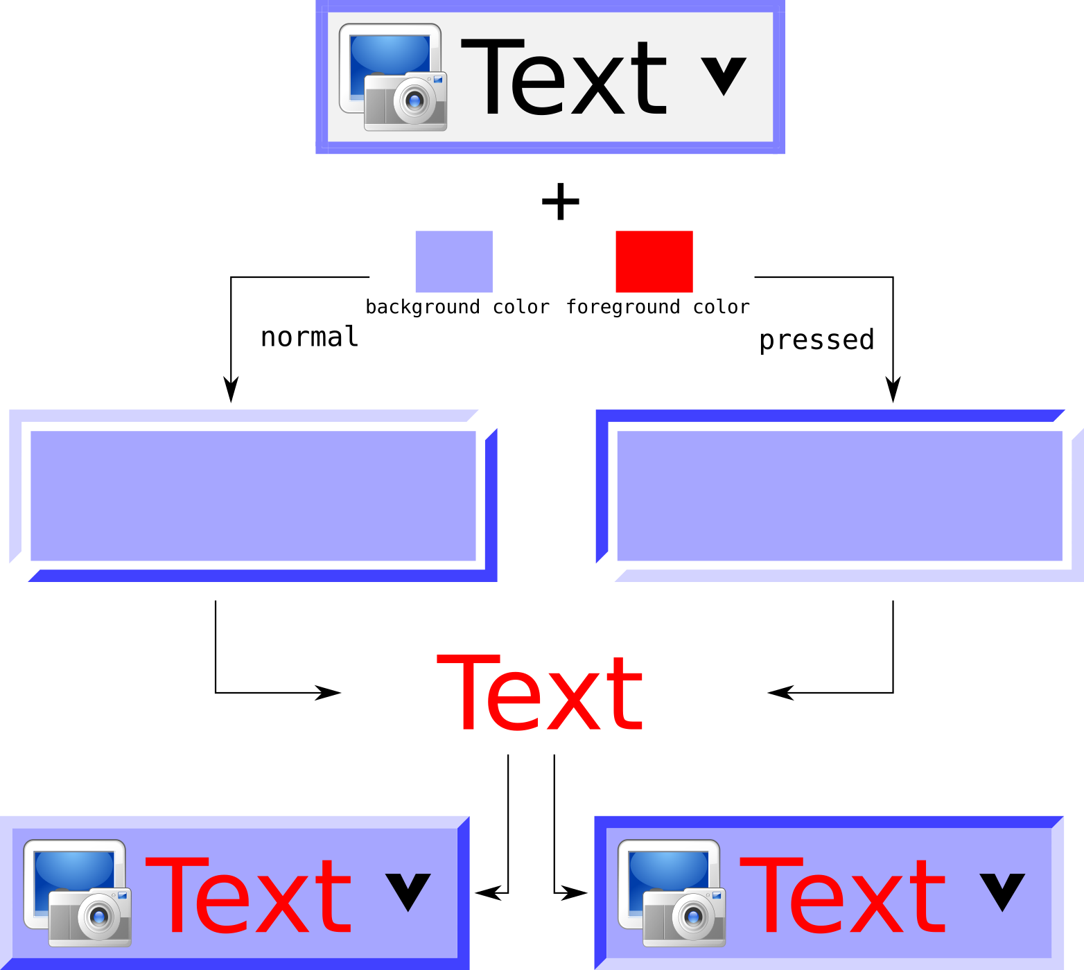
3D effect and colorization process
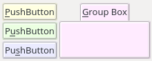
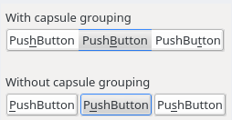
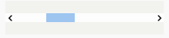
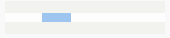
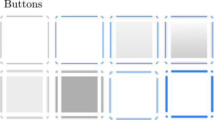
Capsule grouping
Capsule grouping is a special processing used to render push buttons and tool buttons when they are laid out together. When Capsule grouping conditions are met, the buttons are shown as if they are merged together. In this case:
A single frame is shown for the whole set of buttons
The interiors of all the buttons are merged
Here is what capsule grouping looks like, in comparison to normal rendering:
Note
Capsule grouping is a QSvgStyle engine specific rendering feature. It is not natively supported by Qt. As such, applications should not rely on capsule grouping appearance as other style engines do not support it.
Capsule grouping conditions
In order to be rendered in a capsule, the following conditions must be met:
The buttons must be of the same nature (either push buttons or tool buttons)
The buttons must be in the same layout
The layout must be either horizontal, vertical or grid
The layout spacing (horizontal, vertical or both) must be zero
Note
You can put different sort of widgets in the same layout, but only adjacent widgets of the same nature will be put in capsules
Note
Capsules have the same size as the standard rendering
Hint
Layout spacing is never zero by default. So you don’t need to check it when designing your form to ensure that widgets are not put in capsules.
QSvgStyle engine can also render menu items in capsules, given that they have frames. In this case, Capsule grouping conditions do not apply since they are already laid out vertically with zero spacing. For best results, menu tear off should not be forced in theme settings.
Note
Capsule grouping availability is part of the theme settings
Variant Support
A variant is a way of organizing the contents of a widget. Most Qt style engines have only one variant per widget type. QSvgStyle engine features multiple variants for some widgets.
Widgets for which QSvgStyle engine has multiple variants are:
Spin Boxes: The engine supplies the variants
Side by Side,OppositeandStacked. The difference is the location of the up/down buttons
|
|
|
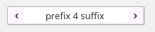
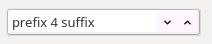
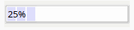
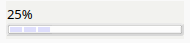
Progress Bars: The engine supplies the variants
ClassicandThin. The latter shows a thin progress bar whose height is adjusted by the theme with the text above it.
|
|
Busy Progress Bars: The engine supplies the variants
Wrap,Back and ForthandFull length. The difference is how the busy cursor is drawn and its run length. For theFull lengthvariant, the direction of the animation can beForwardorBackward.Scroll Bars: The engine supplies the variants
ClassicandNo buttons. With the latter, the scrollbar will not show buttons and control can only be done using the scroll bar cursor. In addition, the engine offers the ability to draw the scroll bar cursor either inside the groove (Inside groove) or on top of it (Overlaps groove).
|
|
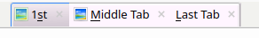
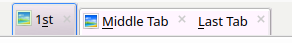
Tabs: The engine supplies the variants
Individual,Group allandGroup non selected. The difference is how the tabs are drawn. This affects both the select tab and the others. When theIndividualorGroup non selectedis active, the selected tab is drawn higher than the others.

|
|
|
Note
The variants QSvgStyle should use are part of the theme settings
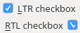
RTL Support
QSvgStyle engine has complete support for Right to Left layouts. This includes of course various widget element arrangement which are reversed. The engine goes further by reversing also the SVG elements used to render the widgets.
For example, if your push button has a shadow on the right in an LTR layout, QSvgStyle engine will draw it on the left when it renders it in RTL. Also, small elements like arrows and check boxes are also flipped.
Startup sequence
Refer to Run in the Quick start guide to know how to make an application or all Qt5 applications use the QSvgStyle engine.
The diagram below describes the files involved when QSvgStyle is loaded by a Qt application:
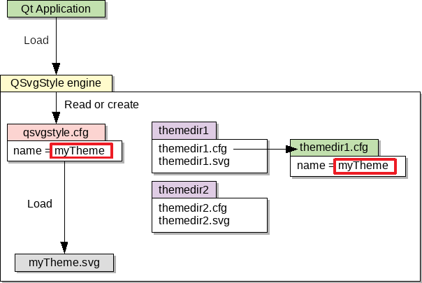
Here are the detailed steps:
The engine first reads the Global Configuration File.
If it does not exist, a default one is created pointing to the built in theme and this one is immediately loaded.
If it exists, the list of user and system themes is built. The themes are then searched for a theme name match.
If there is a match, the theme is loaded. Both the theme configuration file and the theme SVG file are loaded.
If there is no match, the built in theme is loaded.
Note
If a theme is present in both user and system dirs, the user theme takes precedence.
Note
If one of the theme configuration file or the SVG file is missing, the built in theme is loaded.
Qt Widget Rendering Basics
This section gives some basic knowledge about how widgets are drawn in Qt. It focuses on the relationship between the widget and its style engine.
Application, Widgets and Styles
When a GUI Qt application starts, it looks at the desktop environment configuration files to find out the style engine to load.
The loaded style engine applies to all the widgets created by the application, but individual widgets can explicitly use another style engine.
See QApplication::setStyle() and QWidget::setStyle() for programming details.
Widget size
Before any widget rendering can happen, Qt has to know the size of the widget. The size of a widget depends on:
Its style engine. Each style engine can arrange the sub elements of a widget differently, put more of less space between elements or have specific sizes for them.
Its contents. For container widgets like Group Boxes, in addition to the size supplied by the style engine to draw the title and the frame, the size of the group box’s contents has to be taken into account.
To determine the size of a widget, Qt calls the size computation function QStyle::sizeFromContents() by supplying the contents size. This way the style engine can return an appropriate size given its arrangement of the sub elements and the contents size.
Widget size computation automatically happens when the widget is shown for the first time, and in some specific scenarios (children inserted/deleted, content added, …).
QSvgStyle engine contains sizeFromContents() routines for all possible
widgets Qt can show.
Widget painting
When Qt wants to render some widget, it calls its QWidget::paintEvent(). Widget rendering happens quite a lot of time, for example each time it is pressed, released, checked/unchecked, gains/loses, …
The paintEvent() is usually a function that has successive calls
to:
Style engine placement functions
Style engine drawing functions
Style engine placement functions are functions which return, given a widget’s sub element to draw, its rectangle inside the widget.
QSvgStyle engine contains placement functions for all possible sub elements Qt can show.
After placement of a specific sub element has been determined, the
paintEvent() function calls the specific drawing function for it.
QSvgStyle engine contains drawing functions for all possible sub elements Qt can show.
By combining successive calls to placement and drawing functions, the widget composed of many sub elements is gradually drawn inside the space allowed by the size computation function.
Let’s take an example to illustrate how complex it is to draw a widget like a QToolButton:
|
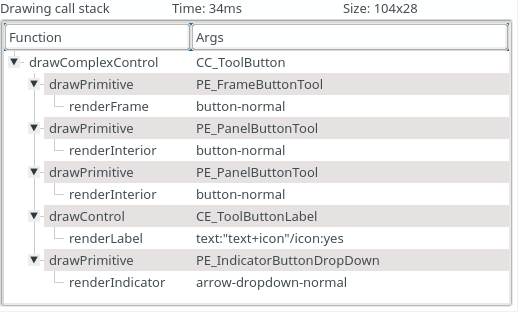
|
Rendering such a tool button with a drop down button involves the following in QSvgStyle engine:
Draw the Frame of the whole button
Draw the Interior of the tool button part
Draw the Interior of the drop down button part
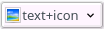
Draw the Label (text+icon)
Draw the down arrow
The figure above only shows draw operations. Prior to the first show, the tool button asked the engine for its size, and prior to each draw operation, the tool button asked the engine for the sub element placement (drop down part, arrow part, …).
The drawing stack of widgets can be shown in the QSvgThemeBuilder Application when tuning the theme’s configuration file.
QSvgStyle Widget Rendering
Rendering Primitives
QSvgStyle can render all Qt widgets using the following drawing primitives:
Rendering happens in this order. Let’s take an example to illustrate this:
Step |
Rendering |
|---|---|
|
|
|
|
|

|
|

|
Final rendering |
|
States
Each of these primitives is rendered using a given state. There are two types of states:
Exclusive states: The widget may only be in one of these states at a time
Overlay states: One of the overlay states is applied on top of one of the exclusive states
The state to use is deducted from the widget’s state.
The table below describes the supported exclusive states:
State |
Description |
|---|---|
|
when the widget is enabled and not in any other state below |
|
when the mouse cursor is over the widget |
|
when the widget is clicked (mouse button pressed over it) |
|
when the widget is checked for chckeable widgets like tool buttons, check boxes, … It is also used for selected items like menus, item views, … |
|
when the widget is disabled |
|
when the widget is disabled in a checked or selected state |
And this one describes the overlay states:
State |
Description |
|---|---|
|
when the widget has keyboard focus |
|
only for push buttons when they are default |
Note
When a widget is both focused and default, the default
overlay takes precedence.
Note
focused and default states only apply to non
disabled widgets by definition
Here is how a push button may look like in the SVG file:
All the states are represented in this picture: normal,
hovered, pressed, toggled, disabled,
disabled-toggled, focused, default.
Note
Some states are not relevant for some widgets. Refer to Theme Specifications for per-widget specifications.
Frames
Frames are drawn for widgets that support them. They have a fixed width which is specified for each widget.
The table below summarizes the admissible settings and values in the
Theme Configuration File for the frame.* settings collection:
Setting name |
type |
Description |
|---|---|---|
|
|
Whether frame drawing is enabled for widgets that support it |
|
|
The SVG id of the element that will be used as a basename to draw the frame |
|
int > 0 |
The width of the frame |
Warning
We strongly recommend to set frame=true for widgets
that naturally have frames, like push buttons, spin
boxes, …
Note
QSvgStyle engine offers the choice of showing some types of widgets like menu items with or without frames
Note
QSvgStyle engine may only draw the frame when the widget is in a specific state. Refer to Theme Specifications for per-widget specifications.
Interiors
Interiors are drawn stretched to fit the interior of a widget,
immediately after the frame if the widget supports one and its
frame is true, or fills the whole rect of the widget if it
does not support a frame of its frame is false.
The table below summarizes the admissible settings and values in the
Theme Configuration File for the interior.* settings collection:
Setting name |
type |
Description |
|---|---|---|
|
|
Whether interior drawing is enabled for widgets that support it |
|
|
The SVG id of the element that will be used as a basename to draw the interior |
|
int > 0 |
For pattern interiors, this sets the width of the pattern |
|
int > 0 |
For pattern interiors, this sets the height of the pattern |
Note
QSvgStyle engine may only draw the interior when the widget is in a specific state. Refer to Theme Specifications for per-widget specifications.
Indicators
Indicators are small elements like arrows, radios, checks, … that are drawn in a square size inside the interior rect.
The table below summarizes the admissible settings and values in the
Theme Configuration File for the indicator.* settings collection:
Setting name |
type |
Description |
|---|---|---|
|
|
The SVG id of the element that will be used as a basename to draw the indicator |
|
int > 0 |
The size of the indicator |
Note
Indicators are not colorized by QSvgStyle engine.
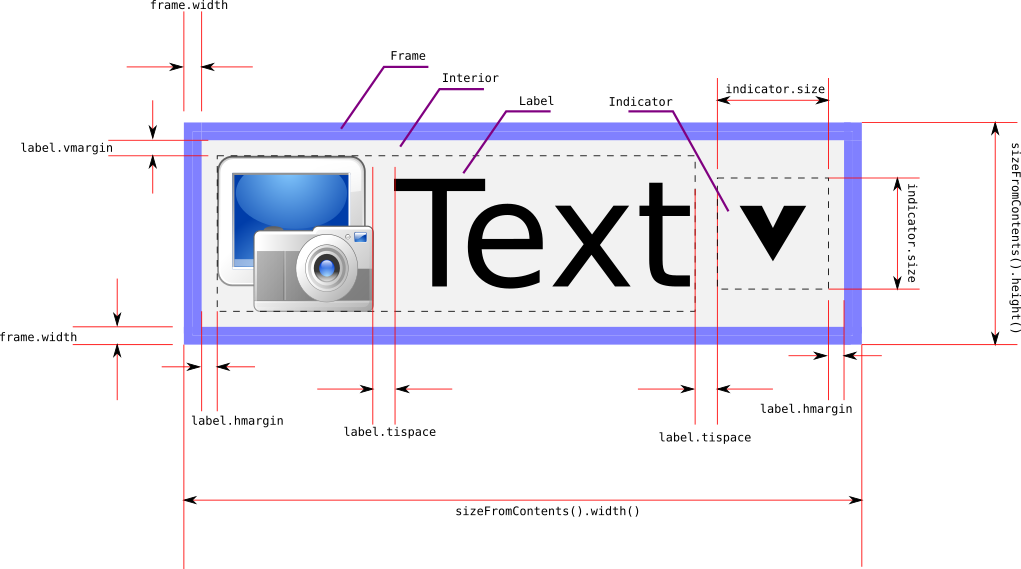
Labels
Labels consist of text and icons that are drawn inside the interior rect. They are supplied by the widget itself and there are no specific SVG objects for them. Only the theme configuration file contains some settings for them, especially margins.
The table below summarizes the admissible settings and values in the
Theme Configuration File for the label.* settings collection:
Setting name |
type |
Description |
|---|---|---|
|
int >= 0 |
The horizontal margin between the interior rect and the label |
|
int >= 0 |
The vertical margin between the interior rect and the label |
|
int >= 0 |
The spacing between the icon and the text |
The figure below illustrates the use of these values in the rendering:
Warning
No matter how big the indicator size is, it will never make the widget’s size grow. The widget’s size is only influenced by its contents (text+icon). If the indicator size is too big, it is scaled down to fit inside the interior rect computed to hold the label. Exceptions to this rule exist.
SVG object naming rules
QSvgStyle engine takes the shapes of Frames, Interiors and Indicators
from the Theme SVG file by looking at the id field of the
SVG objects and matching it with respectively the frame.element,
interior.element and indicator.element configuration entries
in the Theme Configuration File.
The element settings in taken only as a starting point
(basename). It is then modified to obtain the right SVG object to
use.
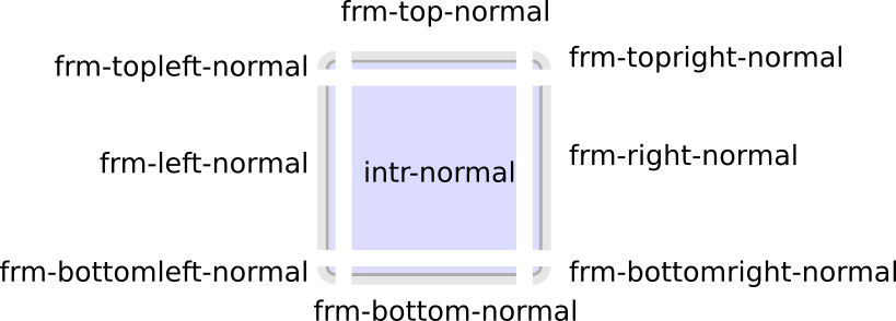
The id searched given a basename is obtained as follows:
for Interiors and Indicators, the state is added like this:
<basename>-<state>for Frames, the state is added first, then the side of the frame, like this:
<basename>-<side>-<state>
The <side> of the frame is one of top, bottom, left,
right, topleft, topright, bottomleft, bottomright.
As you can see, in order to draw a frame, there must be 8 SVG objects per state. This can be lengthy to create and we recommend using the QSvgThemeBuilder Application to automatically generate SVG frames.
Given the following configuration entries:
[PushButton]
frame=true
frame.element=frm
frame.width=5
interior=true
interior.element=intr
and the normal state, here is what the SVG objects should look
like:
SVG RTL considerations
QSvgStyle engine has routines to flip the objects when the layout changes to RTL. As such, when designing themes, objects should always be drawn assuming an LTR layout.
Here is an example of CheckBox SVG objects:
The objects are designed assuming LTR layout, and QSvgStyle engine will flip them when it detects that the used layout is RTL:
All of Frames, Interiors and Indicators primitives are flipped when necessary.
SVG Vertical considerations
QSvgStyle engine has good but incomplete support for vertical widgets. Vertical widgets are those that can be shown vertically, like progress bars, sliders, scroll bars, …
QSvgStyle engine can flip Frames and Interiors, but usually cannot flip Indicators. When a widget requires an indicator to be shown vertically, it has to be explicitly designed in the SVG theme file.
Vertical indicators that have to be designed in SVG file include scroll bar arrows, toolbar separators, view item tree branches, …
Refer to Theme Specifications for per-widget specifications.
Note
Vertical indicators have to be also designed in LTR. QSvgStyle engine will arrange to flip them when the layout is RTL.
SVG design hints
Object Grouping
TODO
Frame width
TODO
Invisible objects
TODO